Recently, many old black-and-white films that have become classics have been painted, so this will not surprise anyone. But have you ever thought about the fact that modern paintings undergo significant color processing and initially look far from as juicy as we see them on screens?


Initially, the frame in the movie looks like this.

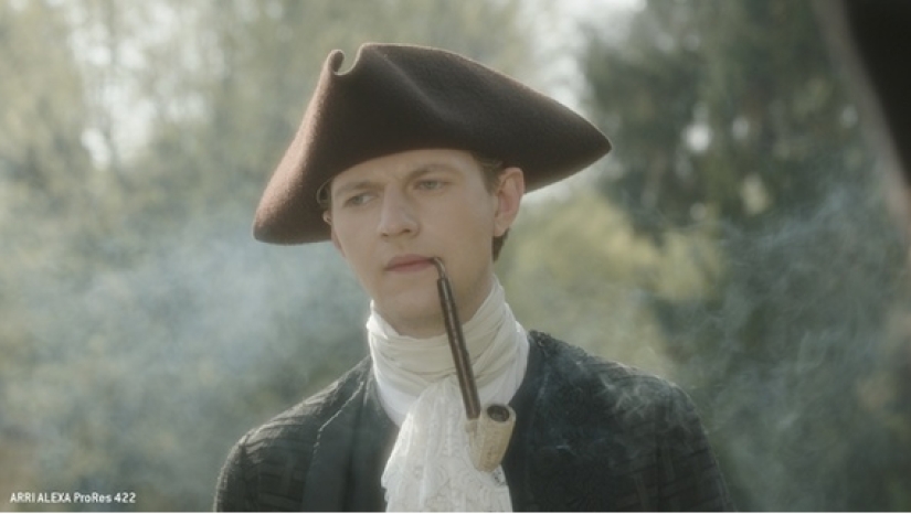

And only after post-production we get this.
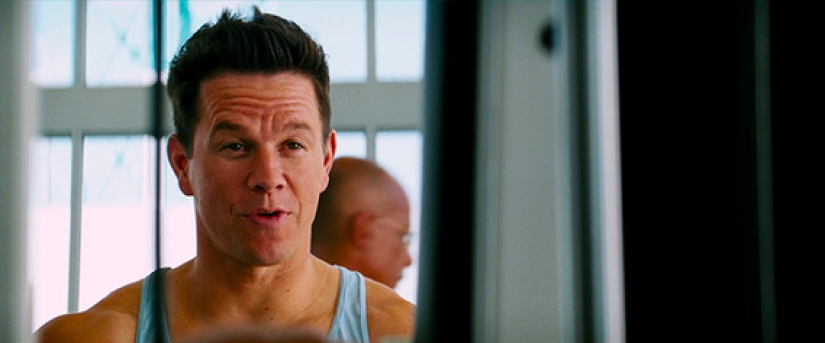
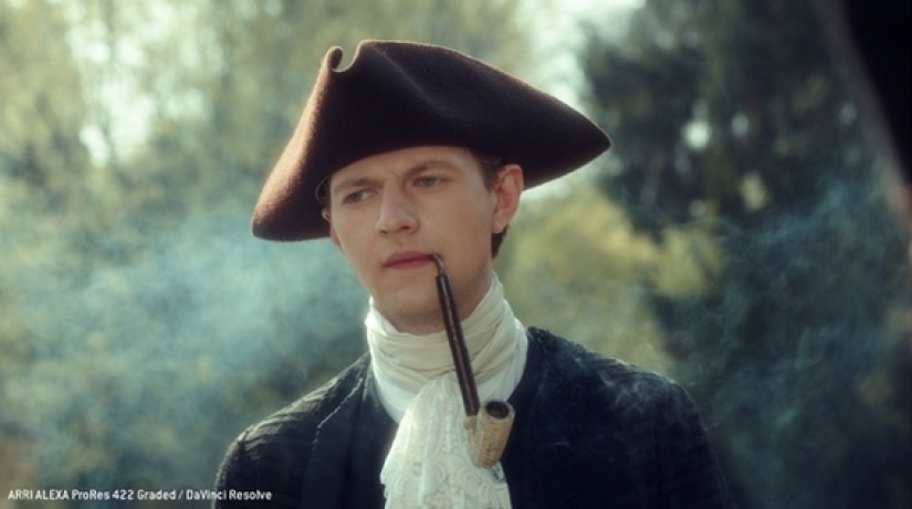

In most cases, they try to shoot in such a "faded" format, which is called logarithmic. This format is low-contrast, has a large dynamic range and extensive color coverage.

And this is done in order for a person who works with color, a colorist, to be more comfortable working with the source material.
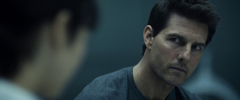
Over the long years of the existence of color cinema, the most popular color schemes have appeared. To select the necessary combination, use the Johannes Itten color circle.
There are five most popular color schemes in cinema.
1. Complementary color scheme
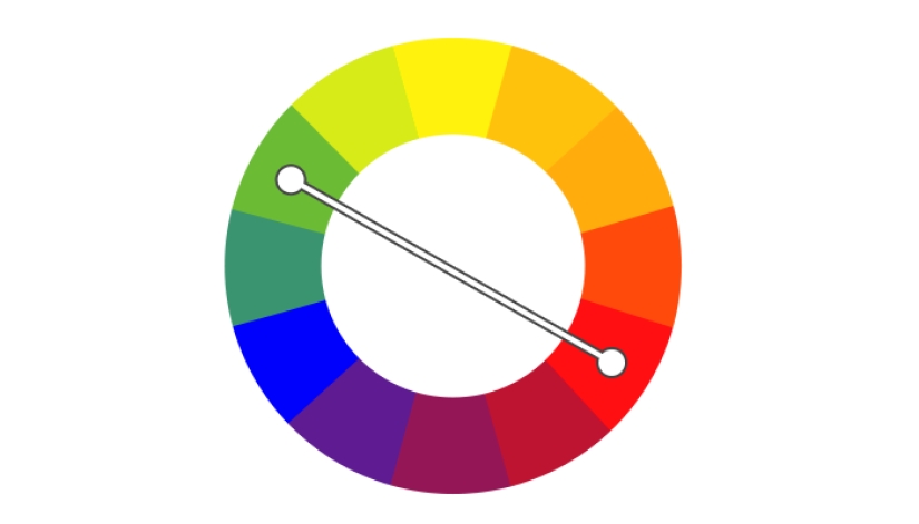 The most common, it combines two opposite colors. This technique helps to give the frame life, as the viewer perceives the use of warm and cold colors in one frame as something very harmonious.
Most often you can notice combinations with blue and light blue, which are so characteristic of modern blockbusters.
About the most popular colors — blue and orange.
The saturation of colors may vary, but complementary pairs of colors often look very natural and delight the public eye. A few more examples:
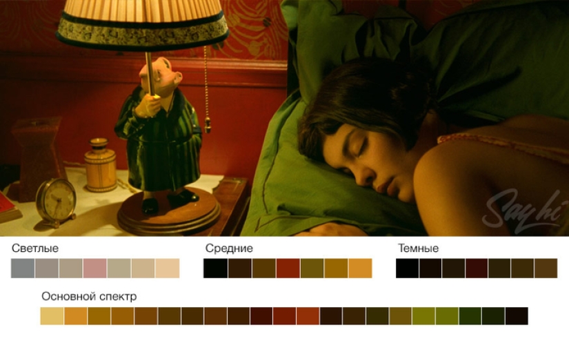 "Amelie" (2001).
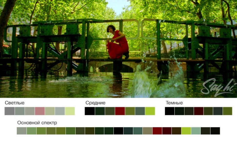 The use of complementary red and green colors.
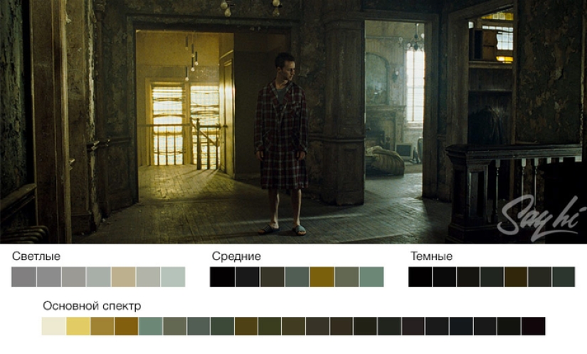 "Fight Club" (1999).
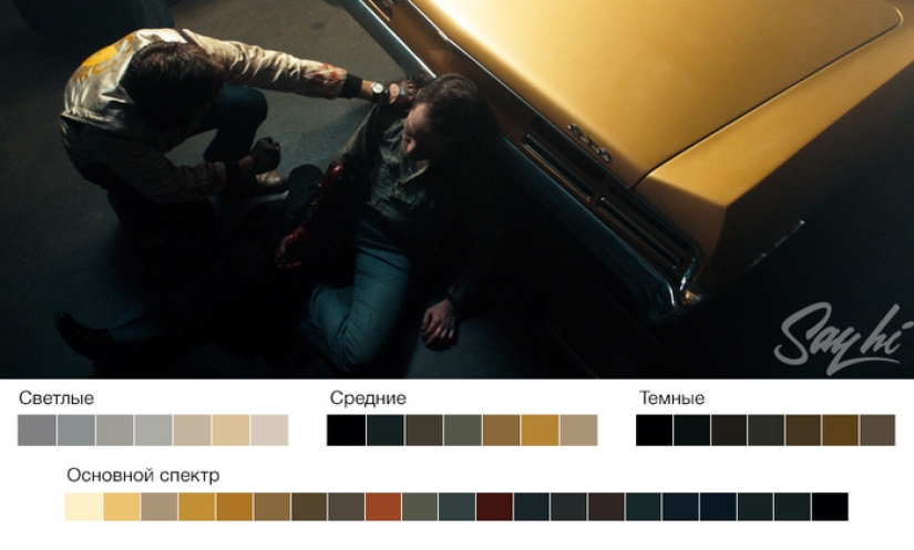 Orange, enhanced in light areas, and greenish-blue color in the shadows of "Drive" (2011).
2. Similar color scheme
 It is usually used to recreate a cozy or harmonious picture.
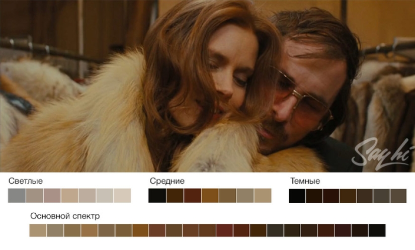 Using adjacent colors avoids contrast. The colors are either only warm or only cold.
3. Ternary color scheme
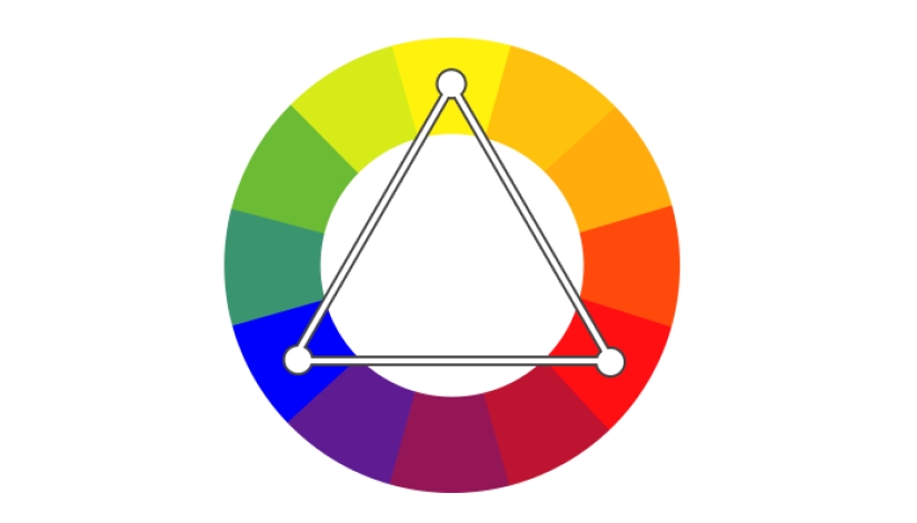
The three colors are equidistant from each other.
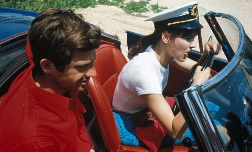 In this scheme, one color dominates the other two. So even not too saturated colors begin to play with new colors.
4. Split-complementary color scheme (contrast triad)

Very similar to the previous scheme, but instead of one opposite color, two are used.
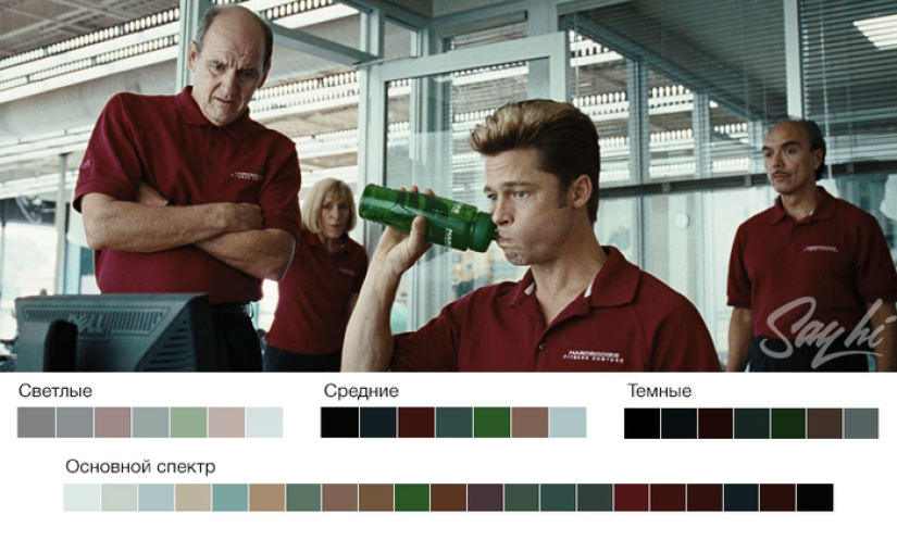 As a result, the contrast persists, but it is not so obvious.
5. Tetraidal color scheme
 A very diverse color scheme of two pairs of opposite colors.
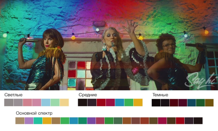 However, the main color is still the same. The opposite one highlights accents, and the second pair of complementary colors acts as complementary. It is used less often, since it is very easy to overload the frame.
Keywords: Before and after | Colorization | Shooting | Movies | Colors
Recent articles

It's high time to admit that this whole hipster idea has gone too far. The concept has become so popular that even restaurants have ...

There is a perception that people only use 10% of their brain potential. But the heroes of our review, apparently, found a way to ...
Related articles

Motherhood significantly changes a woman's body. But there are more profound changes affecting the nature and Outlook. Reflected in ...

Everything is changing. This is well and has long been known to everyone. But when something stays with you for a long time, it is ...

Beloved by many, actor Mikhail Boyarsky has always been distinguished not only by his cheerful disposition and desperate, sometimes ...

New Year's is a time to surprise and delight loved ones not only with gifts but also with a unique presentation of the holiday ...